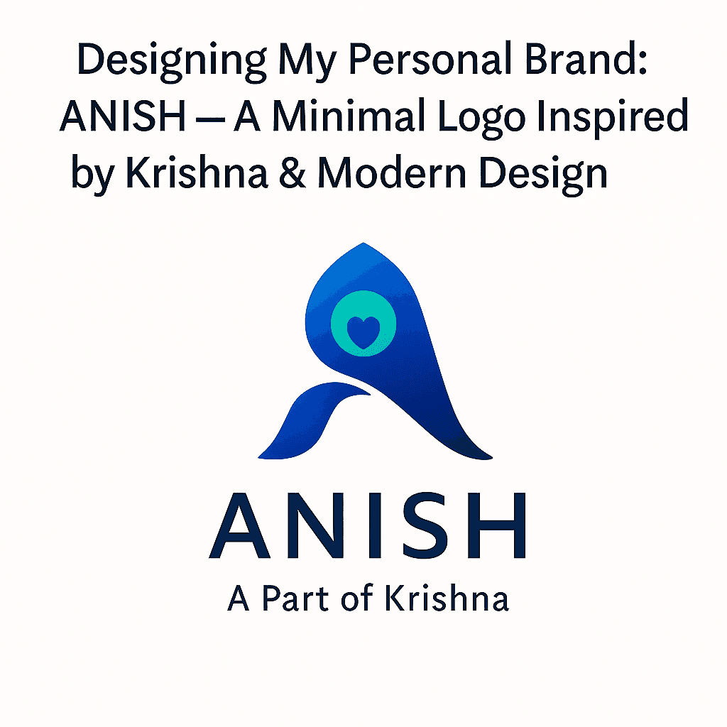
Designing My Personal Brand: ANISH — A Minimal Logo Inspired by Krishna & Modern Design
Dec 3, 2025

Anish Kumar
Product Design Specialist
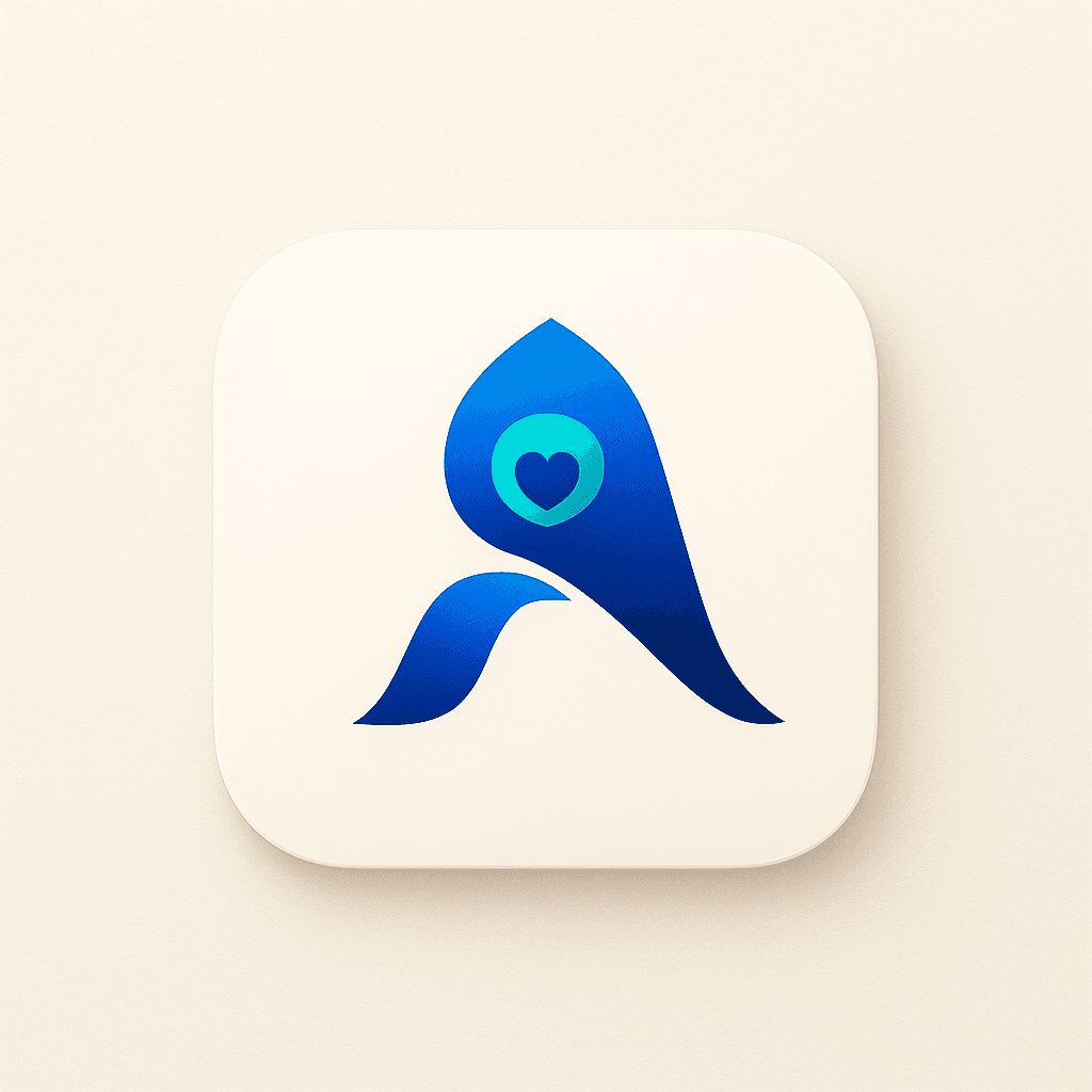
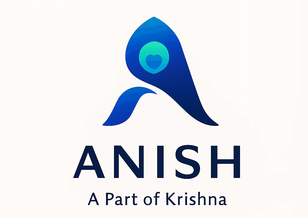
Designing a personal brand is more than making a logo; it is a way of translating identity, values, and philosophy into a visual language that can live across every touchpoint of a designer’s work. In this case study, the goal is to define a brand for “ANISH” that feels modern and minimal, yet deeply rooted in meaning. The word “Anish” itself connects to the idea of being “a part of Krishna,” which becomes the emotional and visual anchor for the entire identity. The result is a logo that merges a clean, geometric letter A with the subtle symbolism of Krishna’s peacock feather, reflecting both spiritual depth and contemporary product-design sensibilities.
The project is approached as a full branding exercise rather than a quick logo sketch. It begins with research and discovery, evolves through sketching and grid-based refinement, and then extends into color systems, typography, usage rules, stationery, and digital avatars. Each step is treated as an opportunity to test whether the identity still feels simple, intentional, and scalable. In doing so, the personal brand becomes a practical asset for portfolios and profiles, not just a one-off visual.
01 — Research and Foundation
Before touching any design tool, the process starts with understanding what the brand should represent. Three pillars define the direction: the personal initial A, the cultural symbolism of Krishna’s peacock feather, and the visual language of modern product design. The initial A must be strong and instantly recognisable, working as the core shape around which everything else is built. At the same time, the reference to Krishna’s feather needs to be subtle rather than literal, so the mark still feels professional and versatile.
The product-design influence ensures that the identity feels aligned with digital products and interfaces. This translates into a preference for minimalism, clarity, and geometry over ornamental styling. The logo must be comfortable in environments like UI layouts, dashboards, and case-study cover images. These early decisions give a clear filter: any idea that looks decorative but does not support clarity, balance, or scalability is discarded.
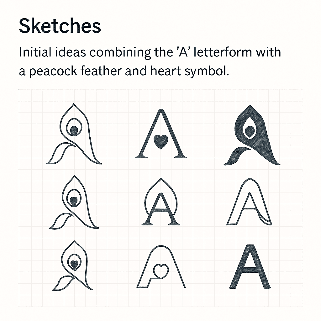
02 — Sketch Exploration
With the foundation in place, the next phase involves exploring as many visual possibilities as possible through sketches. The focus is on how the A can be stylised to echo the graceful curve of a feather without losing its basic letterform. Variations play with the angle of the A, the thickness of the stems, and the way negative space can suggest the inner “eye” of the peacock feather. Heart-like curves appear in some versions to evoke compassion, softness, and emotional warmth.
These sketches are not about perfection; they function as a sandbox where expressive ideas can be tried quickly. By keeping the process loose at this stage, it becomes easier to spot promising directions that balance symbolism and structure. Some explorations lean more toward traditional calligraphic forms, but the strongest candidates remain those that can later translate cleanly into vectors and grids. Once a few solid options emerge, they are shortlisted for refinement.
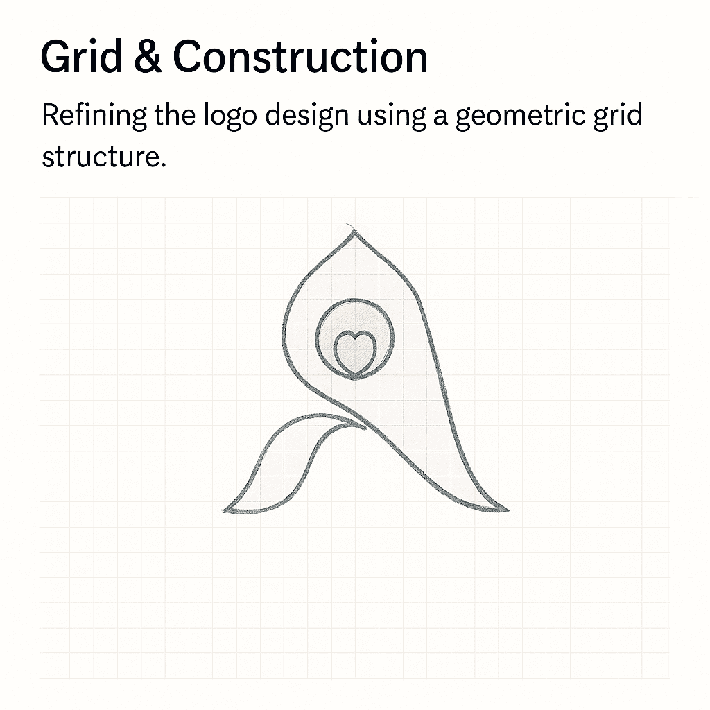
03 — Grid and Construction
To move from expressive sketches to a reliable, reproducible logo, the design is rebuilt on a geometric grid system. Using circles, guides, and alignment rules, the curves of the A and the feather-inspired shapes are carefully adjusted. The grid helps maintain symmetry between left and right sides, controls curvature, and ensures that the line weights feel intentional rather than arbitrary. This phase is where the logo gains technical strength and becomes more suitable for production use.
Working with a grid also improves scalability. Small details that might blur at tiny sizes are simplified or merged into stronger, continuous shapes. The result is an icon that remains clear whether it is used as a favicon, an app icon, or a large hero mark on a portfolio hero. By aligning all elements to a mathematical structure, the logo carries a sense of rhythm and precision that mirrors the logic-driven world of product design.
04 — Color Philosophy and Typography
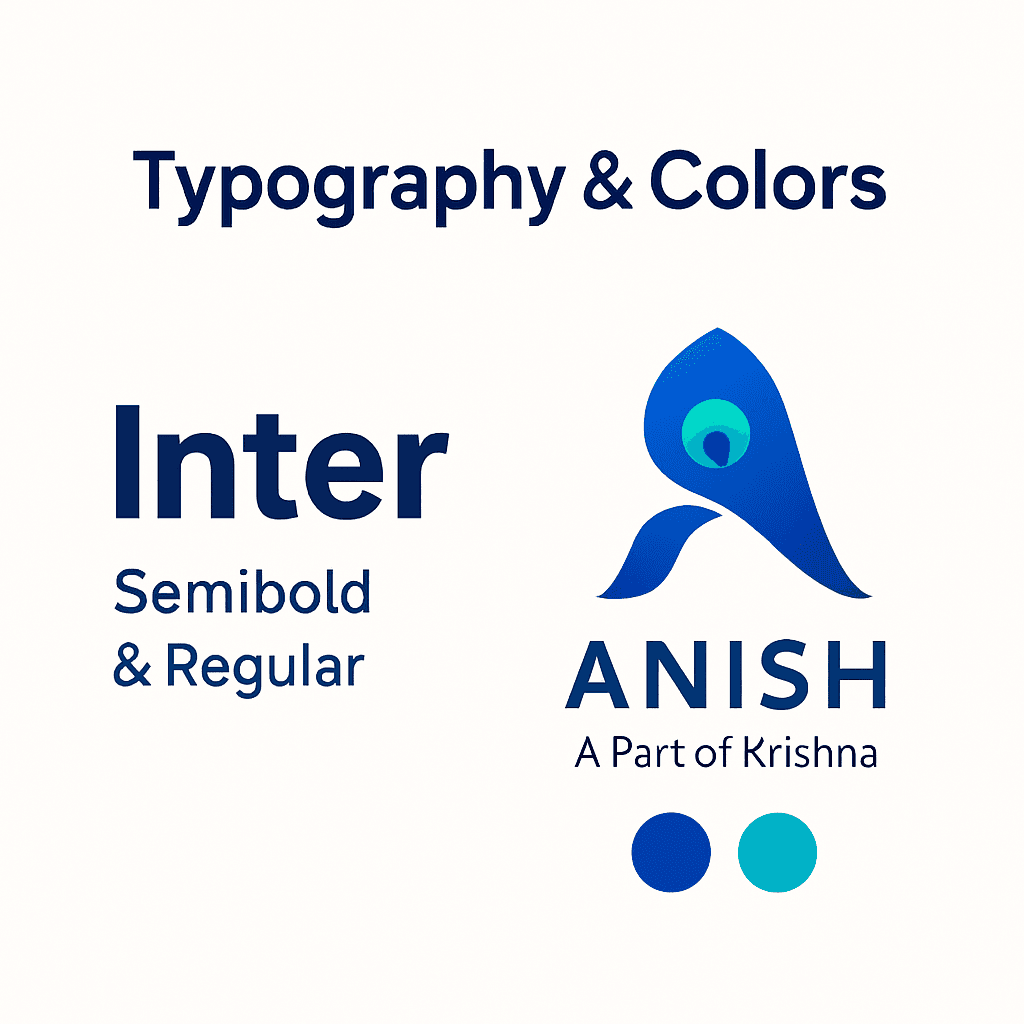
The color system is inspired directly by the traditional palette associated with Krishna and peacocks, translated into a modern gradient-based scheme. Deep Krishna Blue represents calmness, focus, and devotion; Peacock Green adds vibrance and creative energy; Turquoise-like accent tones introduce a sense of motion and spiritual clarity. These saturated hues are balanced with soft neutrals that keep the compositions airy and minimal. Together, they create a palette that feels both spiritual and tech-forward.
Typography is chosen to complement, not compete with, the expressive symbol. A clean, geometric sans-serif similar to Inter is used as the primary typeface. It offers high legibility on screens, neutral personality, and strong alignment with digital-product interfaces. This pairing of organic, symbolic curves in the logo with structured, rational typography creates a visual harmony: one carries emotional weight, while the other delivers clarity and professionalism. The same type system can later extend into UI layouts, decks, and stationery.
05 — Clear Space and Layout Rules
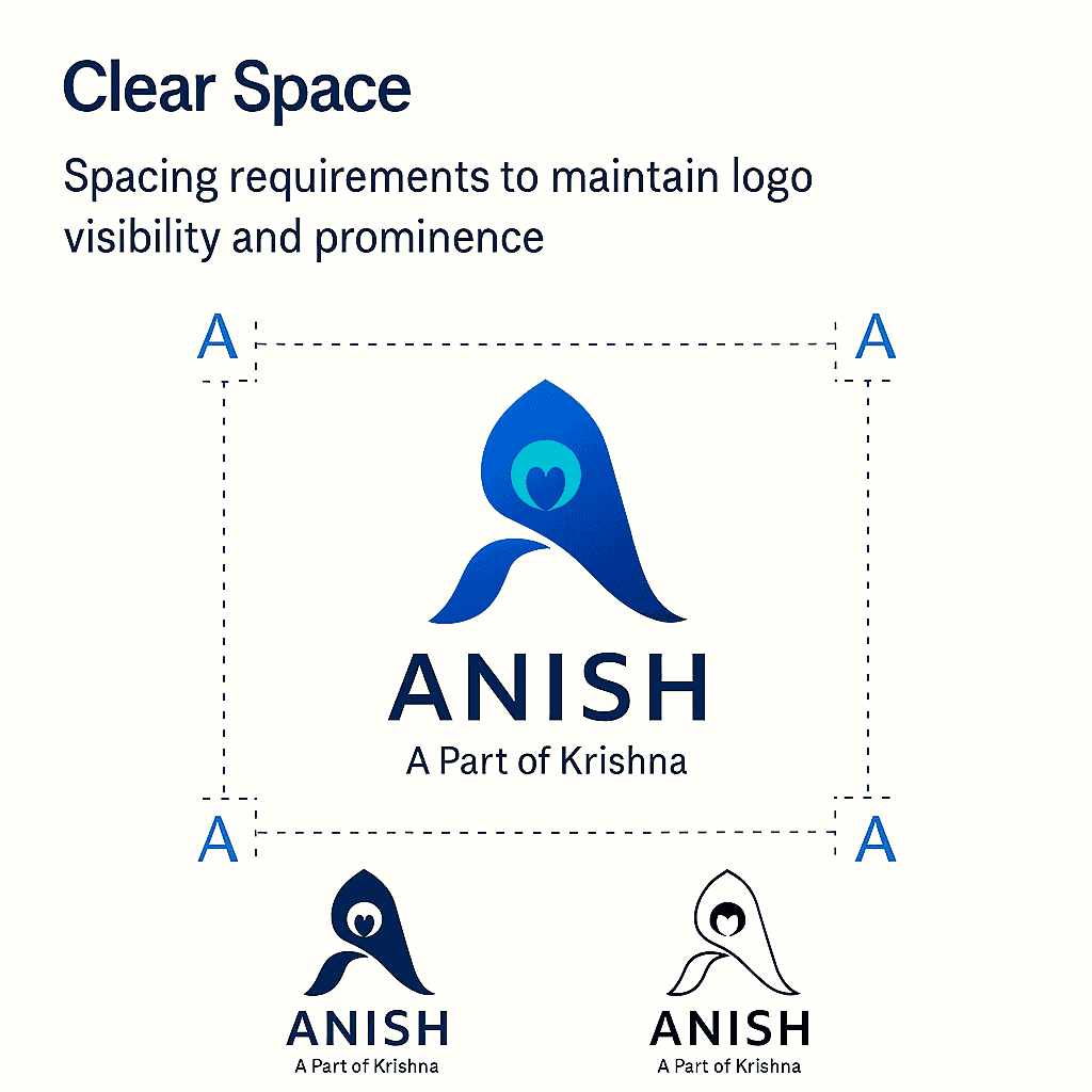
A strong logo is only effective if it is given space to breathe. To protect the mark, clear-space rules are derived from its own internal proportions—for example, using a repeated unit based on part of the symbol’s height or width. This minimum padding is applied around the logo in all applications, preventing it from sitting too close to text, borders, or other graphics.
These spacing rules also serve as guidelines for layout decisions on stationery, website headers, and social banners. By codifying how much room the symbol needs, the brand remains consistent even as assets are created over time. The logo always feels intentional, never squeezed into a corner or overwhelmed by imagery. This is particularly important in responsive digital environments where space shifts across breakpoints.
06 — Logo Variations and Usage
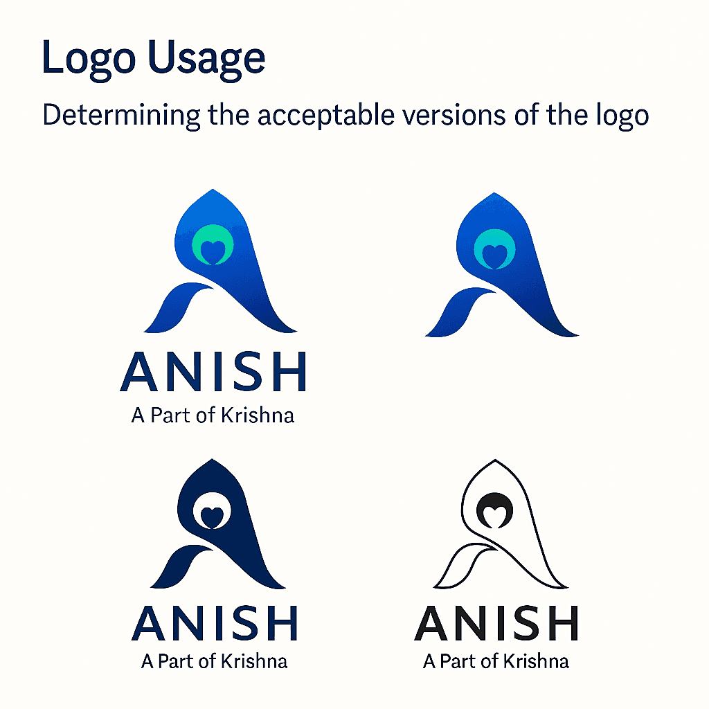
To make the identity flexible, multiple variations of the logo are defined. There is a full lockup with the wordmark for more formal contexts, an icon-only version for compact spaces, and monochrome versions for printing or use on limited-color surfaces. Gradient and flat-color options support both expressive hero visuals and restrained UI elements. Light and dark mode variants ensure the identity looks equally strong on bright backgrounds and deep navy surfaces.
Along with these variations, a simple guide of correct and incorrect usage is created. Correct usage examples show the logo on light neutrals or deep blues, with safe contrast and untouched proportions. Incorrect usage examples demonstrate what to avoid: overly saturated or noisy backgrounds, recoloring that breaks the palette, stretching, and low-contrast combinations. This helps maintain brand integrity, especially when assets are shared with collaborators or used across different tools.
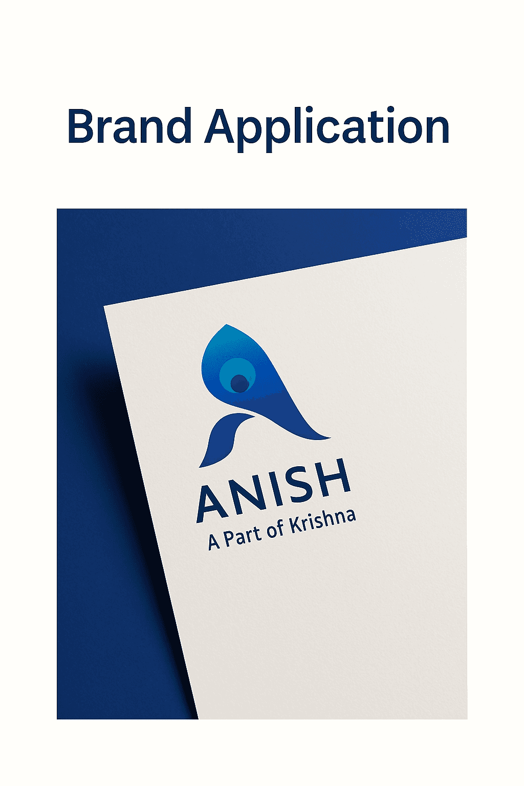
07 — Brand Applications: Stationery and Profiles
To test how the logo performs in real contexts, the identity is applied to a small set of brand assets. Minimal stationery is designed, including a letterhead, envelope, and business card. The layouts keep typography clean and generous, using the logo either as a focal point or a subtle accent. These mockups confirm that the mark holds its presence in print-like settings and still feels aligned with a product designer’s personality.
In the digital world, a circular profile icon is created for platforms like LinkedIn, Behance, Instagram, and portfolio sites. At these tiny sizes, only the simplified icon is used, often with a gradient or deep-blue background. Care is taken to ensure that edges stay crisp and the central shapes remain recognisable even on small mobile screens. This avatar becomes the signature visual that connects all online touchpoints under a single, coherent identity.
Final Reflections
Working on this personal brand becomes both a design exercise and a process of self-reflection. Translating the meaning “a part of Krishna” into a minimal mark requires balancing spirituality with modernity, symbolism with simplicity. Through research, sketching, geometric refinement, color strategy, and practical usage design, the ANISH identity grows into a complete system rather than just a single logo file.
For a product designer, this brand now acts as a foundation for future case studies, presentations, and collaborations. It communicates purpose, calmness, creativity, geometric thinking, and a subtle spiritual layer that feels authentic rather than decorative. Most importantly, the process reinforces an important lesson: a meaningful personal brand is not rushed. It is designed with the same care and intention that one would bring to any serious product.